 From the Not-So-Artistic Department...
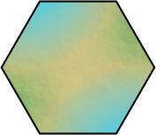
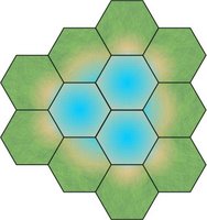
Pictured at left is a snippet from a map concept I'm working on. It should remind you of a narrow segement of land between two water areas. The effect is a bit lost here, but looks not bad when you get several of these style of tiles together (and then they get the margarita mix out ...).
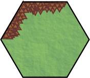
On the other hand we have this sad eddiface. It is meant to conjure thoughts of mountains and highlands. Not so nice.
Soooo... if anybody has any tutorial sugestions on drawing stylized mountains, I'm open to it.
 See really nice effect put together (I like it.).
2 comments:
Mountain peeks should point up not down. :) That's my two cents.
You need to start your fill from the back row, overlapping towards the front. The triangles ahould indeed "point up".
You could also gradiate the colors so the ground gets more brown before the mountains start - like foothills.
Post a Comment